The Cresting Wave of Junya Ishigami
Undoubtedly the most widely known Japanese proverb is “The nail that sticks out gets hammered down.” It takes mere days, nay hours, in the country for the newcomer to see the truth in this, as the orderliness of Japanese society begins to lure him into conformity. There is generally a single way to do just about everything, as “proven” by centuries of tradition.
What then, of the nail that is crooked? To me, the heart of Japanese design lies in the constant tension between the straight and the curved. A student of any classical Japanese art will be familiar with the concept of Shu Ha Ri, which are the three stages of learning. Shu is mimicry, in copying the predetermined forms as epitomized by the example of your teacher. In Ha, your technique begins to take on a slightly different form, yet one still bound by the limits of the character and physical form of the student. With Ri, the student, having become now a master, takes the art into a completely new direction. It is here that the nail begins to bend.
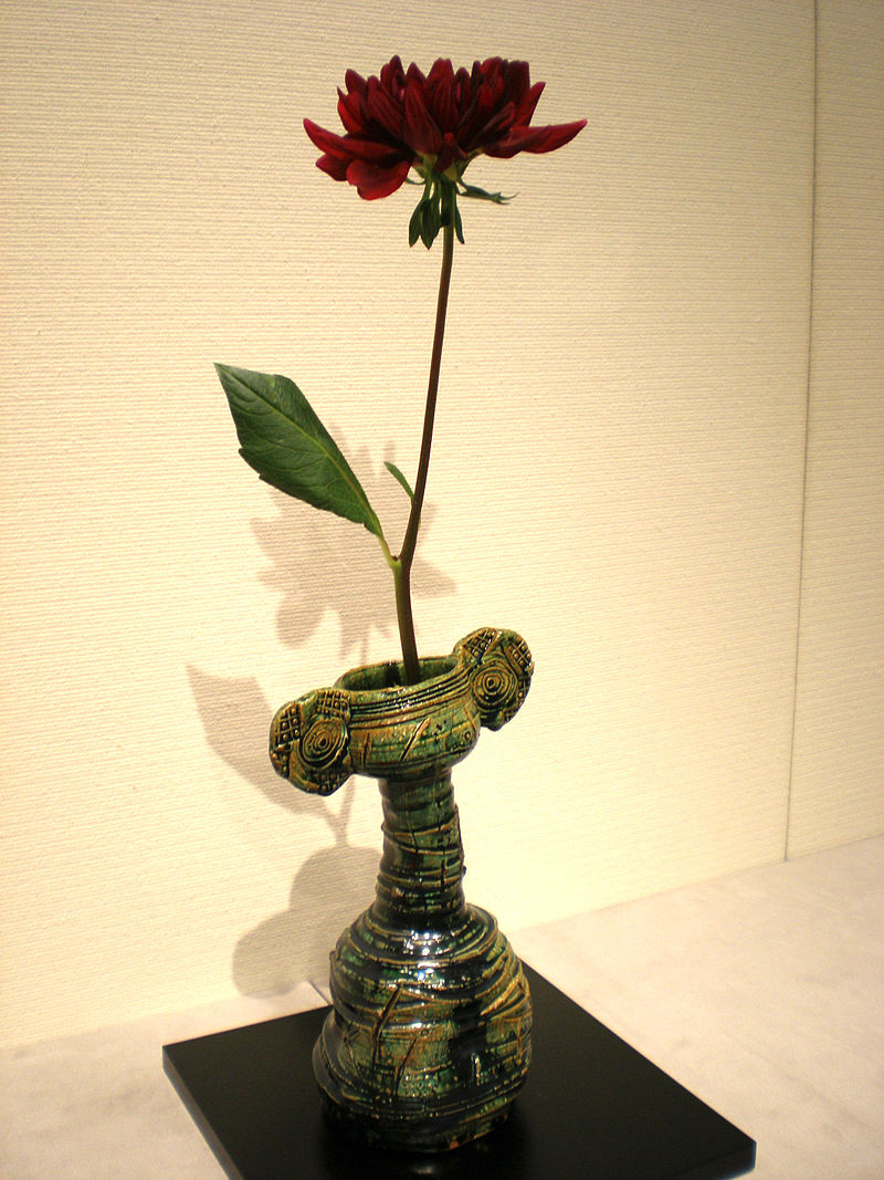
Ikebana Flower Arrangement in Oribe vase, picture by CC BY-SA 3.0
Looking over the history of Japanese culture, we see that the innovators are the ones who have most closely followed the curves. Early potters drew upon the more symmetrical traditions of China and Korea before Furuta Oribe moved away from these earlier karamon styles to a rougher form called quite poetically, the “aesthetic of discord.” Ikebana flower arrangement had for centuries been defined by the holy trinity of “heaven, earth, and man, ” each symbolized by a single organic element. Sofu Teshigahara and his Sōgetsu school deviated wildly from this linear approach with the introduction of new materials such as wire and plastic in order to prove the boundlessness of that same trinity. The movements of the traditional performers of Noh and Kabuki theater were limited by the strict physical limits of their respective stages, yet the movements of their contemporary heir butoh go far beyond the curve into spirals. (The square watermelons of present day Japan prove an exception to the rule, having gone in the other direction.)
Graphic art and architecture followed a similar path. Up until the beginning of the Edo period, Japanese painting was monochromatic and generally bound by the limits of the rectangular frames (a near metaphor for the top heavy, repressive times in which they worked). In the more genteel times of the Pax Tokugawa, ukiyoe woodblock artists began to experiment both with subject and color, culminating in the swirling action of Hokusai’s The Great Wave off Kanagawa and Utagawa’s Suikoden battle series.

Yang Lin, hero of the Suikoden (The Water Margin). Woodblock print by Kuniyoshi Utagawa
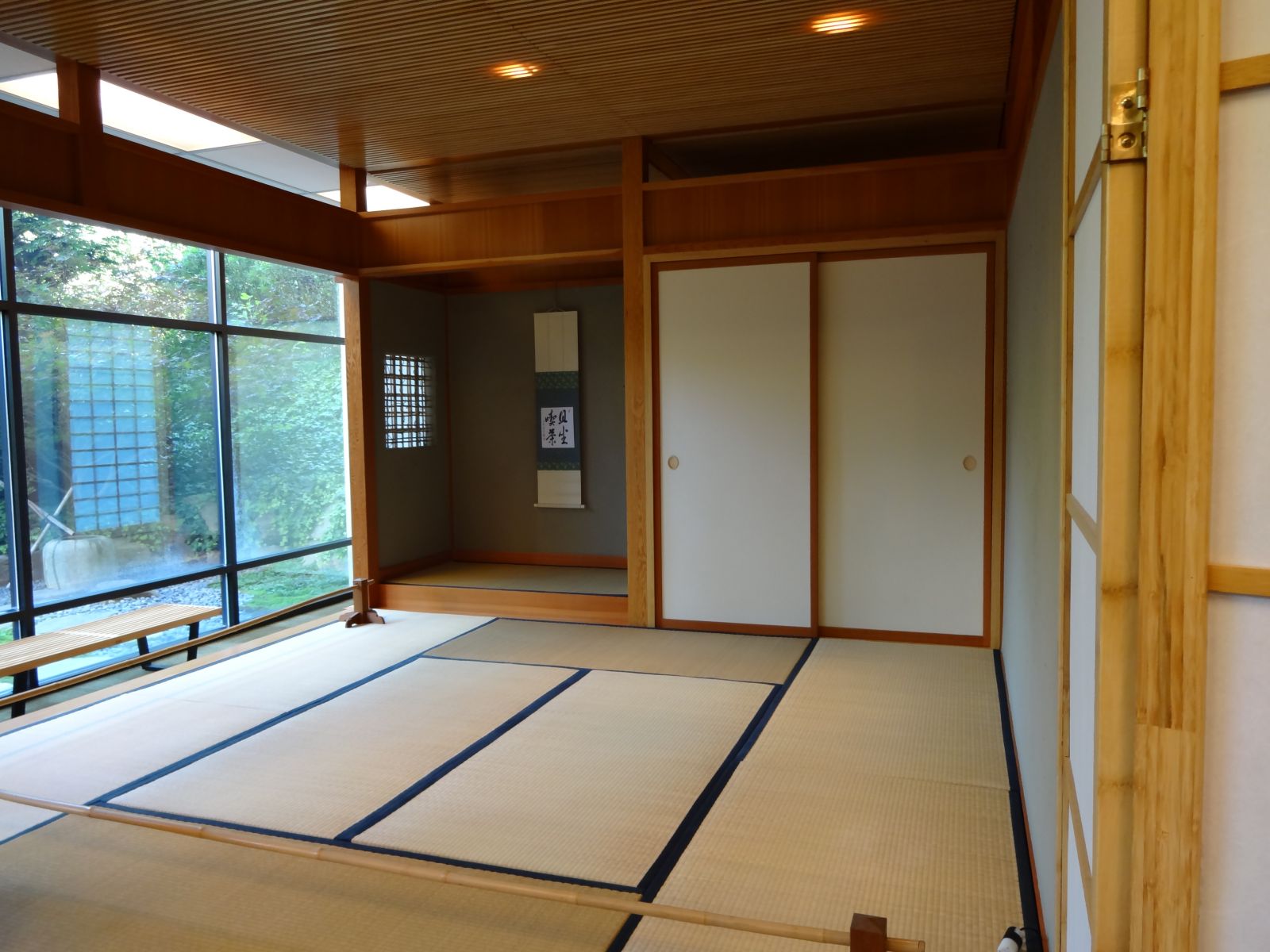
Architecture throughout most of Japan’s history was defined by the strict right-angles of the typical Shoin style room of shoji screens, fusuma doors and tatami matted floors. Even in Japan’s modern period, its buildings and homes remained for the most part symmetrical and linear. This was partially dictated by the threat of seismic and atmospheric destruction, and partially by the fashions of the time.
Example of Shoin style room. Nakatani Tea Room, CSU Sacramento, picture by Howcheng (CC BY-SA 4.0)
As elsewhere in the world, social changes began to grow more widespread in Japan in the late 1960s/early 1970s and the rigid verticality of the nail began to be seriously challenged. Standing above the demonstrations on the streets of Tokyo were buildings influenced by the principles the Metabolist movement. In the bookshops nearby, comic books burst energetically beyond the borders of the printed page. It is easy to see the direct linear path (if you’ll excuse the pun) from ukiyoe to these manga and their subsequent moving form, anime. In the films of Hayao Miyazaki, master of the latter, you’d be hard pressed to find a straight line at all.
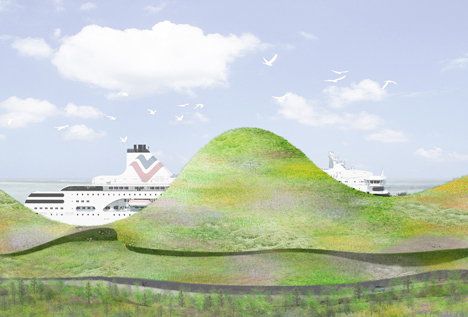
Port of Kinmen Passenger Service Center, design by Junya Ishigami
Looking at the work of some of today’s award winning young architects, it is easy to assume a childhood spent poring over manga. Junya Ishigami’s design for the ferry terminal on the Taiwanese island of Kinmen comes directly from a comic. His design for Copenhagan’s harbor brings immediately to mind the clouds of Miyazaki’s numerous scenes of flight.
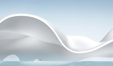
House of Peace design for Copenhagen Harbor by Junya Ishigami
Like Miyazaki, Ishigami draws his inspiration from nature. This can be said about a great deal of architects, yet it seems that Ishigami draws more criticism than most. Perhaps it is because he has taken that ideal to its furthest reaches, in paring down a structure to only the most basic elements, and creating a structure that appears to have very little substance at all. This doesn't go down well in a country that writer Alex Kerr accuses of being addicted to concrete.
Yet the critics are not the only ones talking about Ishigami. At the young age of 42, he has already won numerous awards, most admirably, the Golden Lion for Best Project at the 12th Venice Architecture Biennale, as well being as the youngest ever recipient of the Architectural Institute of Japan Prize for the Kanagawa Institute of Technology KAIT Workshop in 2009.
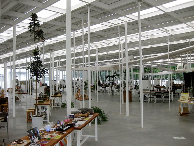
KAIT Workshop, 2009 by Junya Ishigami, picture by Epiq (CC BY-SA 3.0)
It is with a certain delightful irony that the resulting Kanagawa Institute is Ishigami’s most linear. It is all beautiful straight lines, of sparse white beams that frame expansive windows. When seen at night, the lights emitting through the slats in the roof look from above like a barcode, a statement that Ishigami may or may not have intended. Yet rather than being burdened by the heavy encumbrance of tradition, the building hovers there ephemerally, the eyes of the viewer being drawn directly through it to the natural world beyond. For it is there, outside structure, that true value lies, a proverb of its own that Ishigami and his work continues to exemplify.
Edward J. Taylor is a writer and editor based in Kyoto, Japan. Previously he has written for ZenVita on the architecture of Kenzō Tange, Kengo Kuma, Shigeru Ban, Kazuyo Sejima, and Toyo Ito.
For more innovative designs from Japanese architects visit the ZenVita Projects page. ZenVita offers FREE advice and consultation with some of Japan's top architects and landscape designers on all your interior design or garden upgrade needs. If you need help with your own home improvement project, contact us directly for personalized assistance and further information on our services: Get in touch.
SEARCH
Recent blog posts
- November 16, 2017Akitoshi Ukai and the Geometry of Pragmatism
- October 08, 2017Ikebana: The Japanese “Way of the Flower”
- September 29, 2017Dai Nagasaka and the Comforts of Home
- September 10, 2017An Interview with Kaz Shigemitsu the Founder of ZenVita
- June 25, 2017Takeshi Hosaka and the Permeability of Landscape
get notified
about new articles
Join thousand of architectural lovers that are passionate about Japanese architecture
