Kazuyo Sejima and The Structure of Relationship
A dozen years ago or so, on my way to a trekking trip in the Himalayas, I was treated to a bit of serendipity in the form of a massive exhibition of Tibetan Art, held in Osaka’s Expo Park, under the watchful gaze of Taro Okamoto’s ever-cranky “Tower of the Sun.” One of the exhibits was a one-meter tall replica of a Buddhist stupa. Climbing the adjacent set of steps and looking directly down upon it, I was amazed to see that the stupa was in a fact a 3D, vertical expression of a mandala, perhaps one of the most recognizable symbols of Tibetan culture. What had been a short detour on the way to Kansai Airport opened my eyes in ways I had never imagined, and I’ve never looked at a stupa or pagoda the same way again.
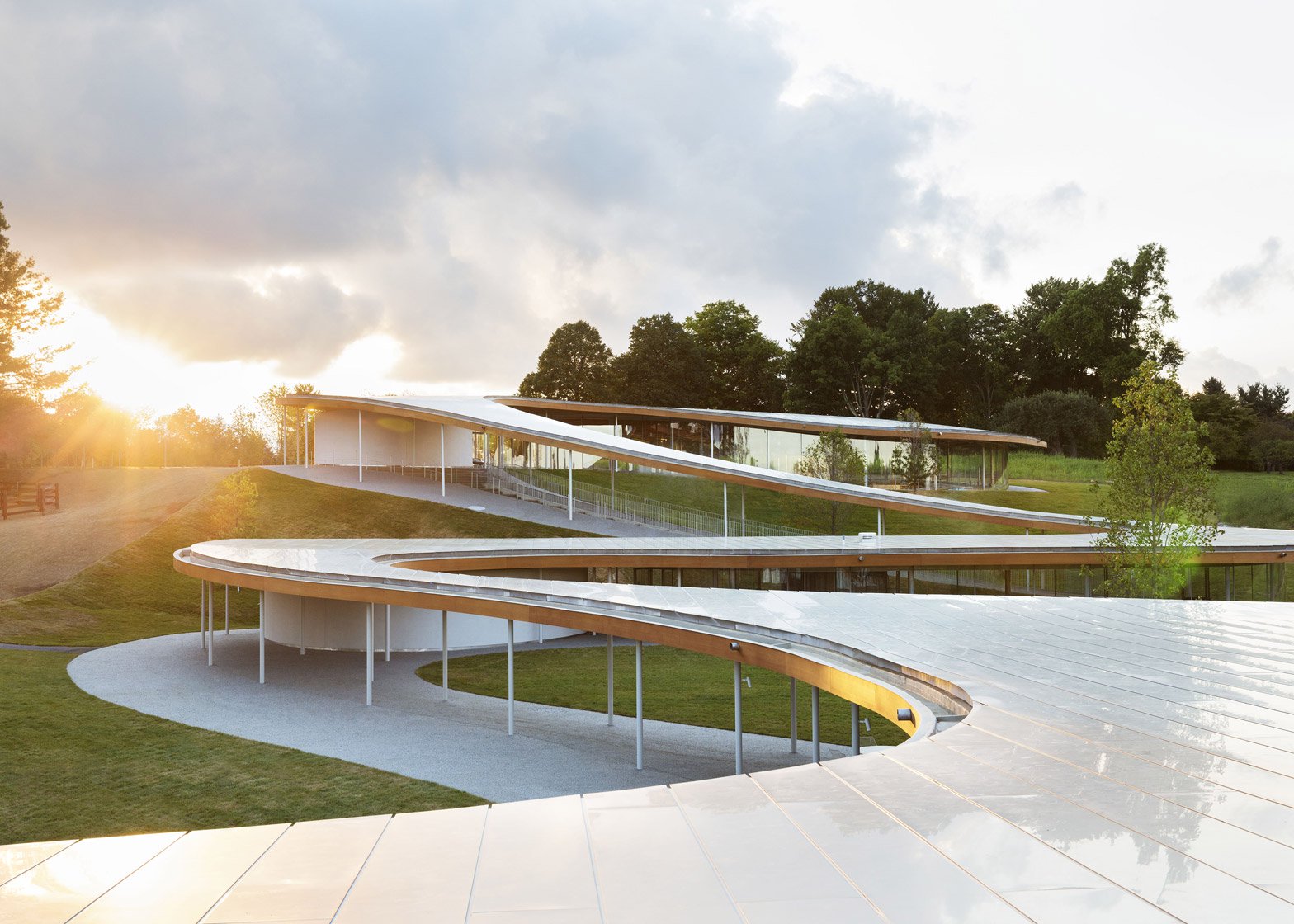
The Grace Farms River Building by SANAA; photograph by Dean Kaufman
Years later, looking down from the reconstructed ramparts of Kanazawa Castle upon that city’s 21st Century Museum of Contemporary Art, I thought that its circular shape too must look like a mandala if viewed from the air, or perhaps Google Earth. (And if you too go there, have a look at Tokyo’s wonderful Bank of Japan building, shaped like the kanji for ‘yen.’) And like a mandala, the museum’s structure is defined by what isn’t there, purposefully left for the viewer to fill in.
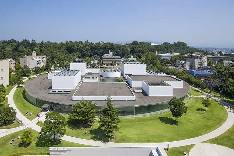
21st Century Museum of Contemporary Art by SANAA; image courtesy of Kanazawa City (CC BY 2.1 jp)
Lying at the heart of the Japanese design aesthetic is the concept of ‘ma,’ which can be loosely translated as negative space. Time and again it can be seen (or unseen) in the sparsity of a brushstroke, in the empty corner of a painting, in the seeming arrhythmia of traditional music, in the pregnant pause of dialogue in film, in the fighting distance between swordsmen. Rather than an absence, ma is an interrelationship.
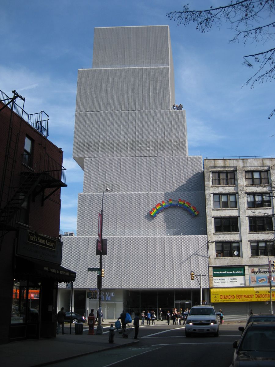
The New Museum of Contemporary Art by SANAA & Gensler; image by Nick-D (CC BY-SA 3.0)
Kazuyo Sejima mastered this interrelationship in her 21st Century Museum, by breaking down the structure’s component parts in a way that still seems to form a concise whole. Her design for the Bowery’s New Museum of Contemporary Art in New York works in the same way; a simple stack of plain white blocks that look like they were abandoned in mid-play.
Elements of this can be found in her earliest works (which won her notoriety as the Japan Institute of Architects’ Young Architect of the Year), it was really after she teamed up with Ryue Nishizawa that it found its true form. Sejima and Nishizawa met while working for Toyo Ito, and in 1995 the two founded SANAA (Sejima and Nishizawa and Associates). I personally like how the name SANAA harkens a parallel with the word ‘sanitary,’ for the viewer is quick to notice the clean slick lines of their work. Glass is the most commonly used surface, where the ‘ma’ allows for the interplay of interior and exterior. Plus the reflective qualities of glass help to form a relationship with its surroundings.
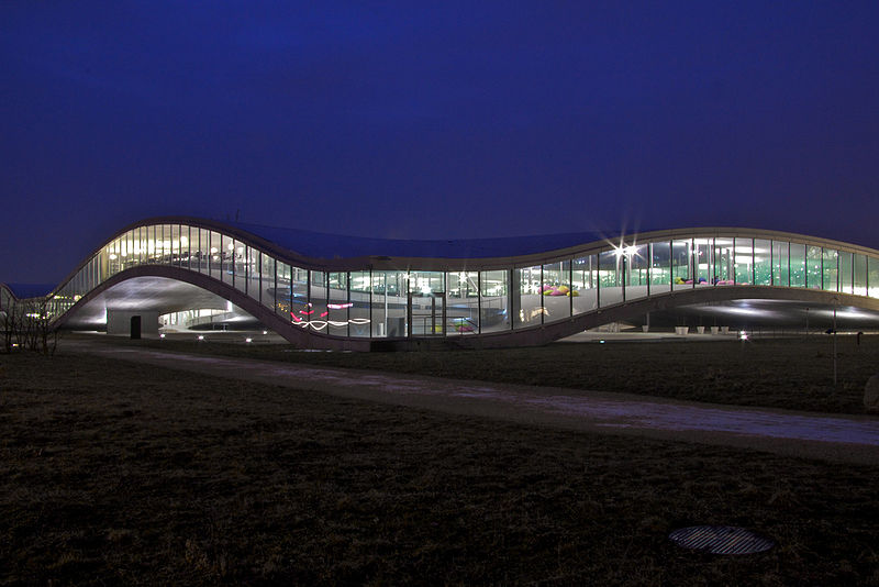
The Rolex Learning Center by CC BY-SA 3.0
The playful nature of Sejima and Nizhizawa’s work goes beyond the aforementioned use of blocks and cubes. The architects claim that this “touch of humor, the spatial ambiguity and the use of reflections all demand that you visit the buildings to really understand them. “ Photographs can’t quite capture the sprawling, serpentine nature of some of their more recent works, Lausanne’s Rolex Learning Center, Connecticut’s Grace Farms River Building, and most amazingly, France’s Musée Louvre-Lens. These are buildings that need to be interacted with.
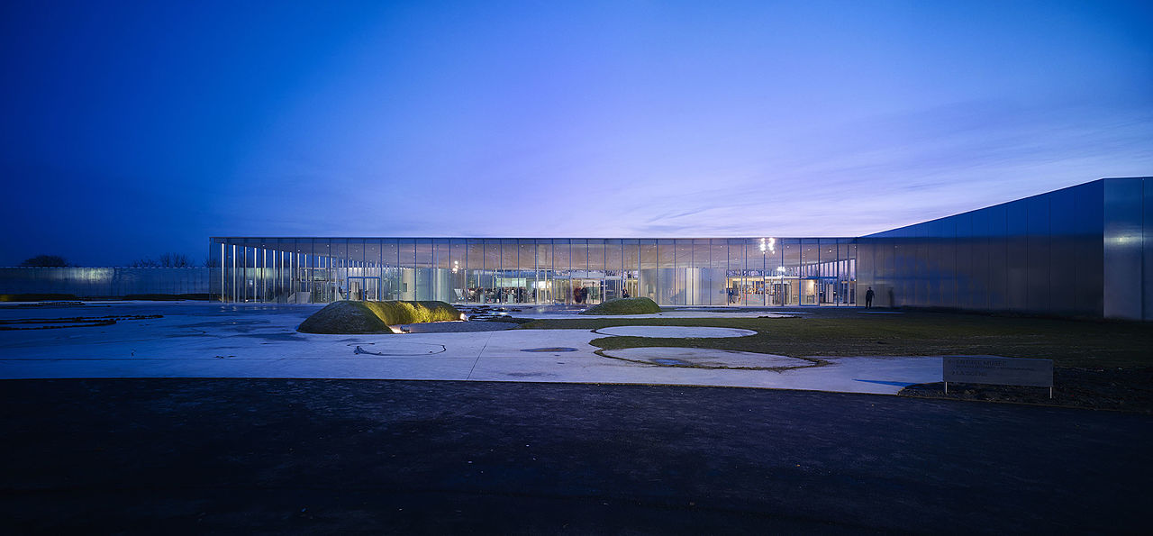
Musée Louvre-Lens by SANAA & IMREY CULBERT; Image by CC BY 2.0
In addition to having been awarded a number of prizes worldwide for her work, Sejima and Nishizawa won the Pritzker Prize in 2010, she becoming one of only two women to do so (and Nishizawa the youngest laureate), preceding her former employer Toyo Ito’s own award by three years.
The Prize has been criticized of late for not recognizing the work of women in architecture, a criticism that can be extended to the world of architecture itself. And I may over-generalize (and perhaps be accused of unintentional sexism) in suggesting that since ancient times, men have historically built monuments to their glory, while women have tended to the more difficult challenge of building relationships within family and community. How fitting I suppose that Sejima’s body of work undertakes the delicacy of such a venture, of creating monuments not to glory, but to harmony. This truly should be architecture’s fundamental goal.
Edward J. Taylor is a writer and editor based in Kyoto, Japan. Previously he has written for ZenVita on the architecture of Kenzō Tange, Kengo Kuma, Shigeru Ban, and Toyo Ito.
For more innovative designs from Japanese architects visit the ZenVita Projects page. ZenVita offers FREE advice and consultation with some of Japan's top architects and landscape designers on all your interior design or garden upgrade needs. If you need help with your own home improvement project, contact us directly for personalized assistance and further information on our services: Get in touch.
SEARCH
Recent blog posts
- November 16, 2017Akitoshi Ukai and the Geometry of Pragmatism
- October 08, 2017Ikebana: The Japanese “Way of the Flower”
- September 29, 2017Dai Nagasaka and the Comforts of Home
- September 10, 2017An Interview with Kaz Shigemitsu the Founder of ZenVita
- June 25, 2017Takeshi Hosaka and the Permeability of Landscape
get notified
about new articles
Join thousand of architectural lovers that are passionate about Japanese architecture
